Český královský institut
Copywriting | Social Media Management | Graphic Design
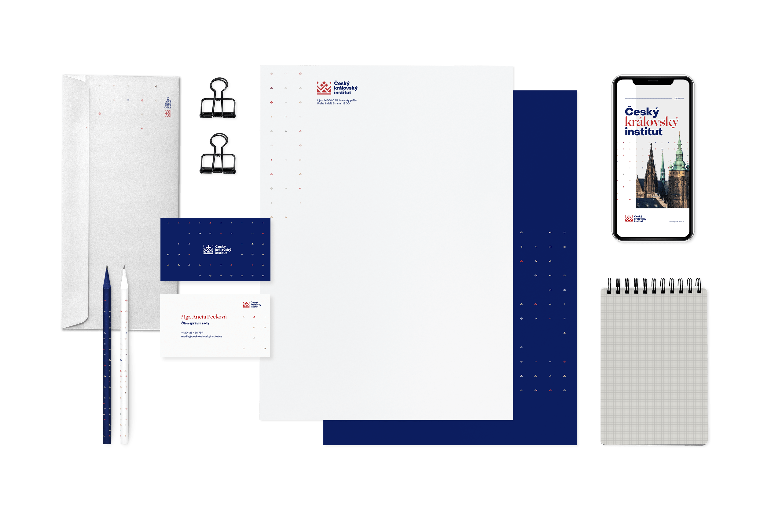
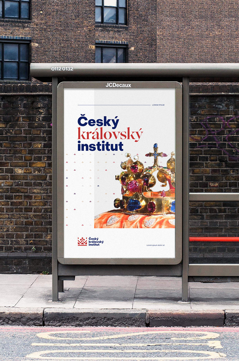
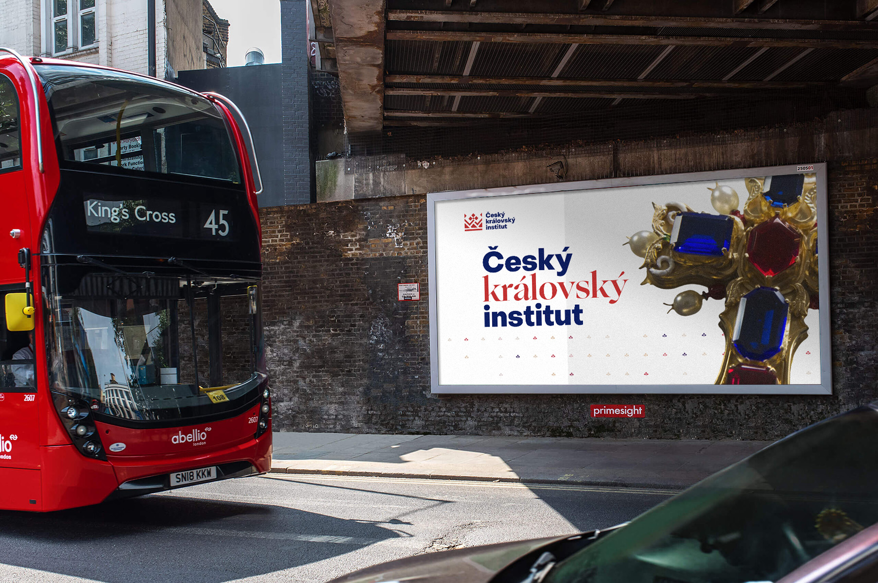
The client wanted a new brand that would describe him perfectly in a modern take with reference to history. We added the symbol of a lily to the original logo, which is a typical element of the Crown of St. Wenceslas. A fragment of a lily also forms a connecting element, creating a pattern evoking a royal ermine that perfectly ties the entire visual identity together. We also created a new typography and colours. The elements can be used across all communication channels so that it is clearly recognizable as the Český královský institut.
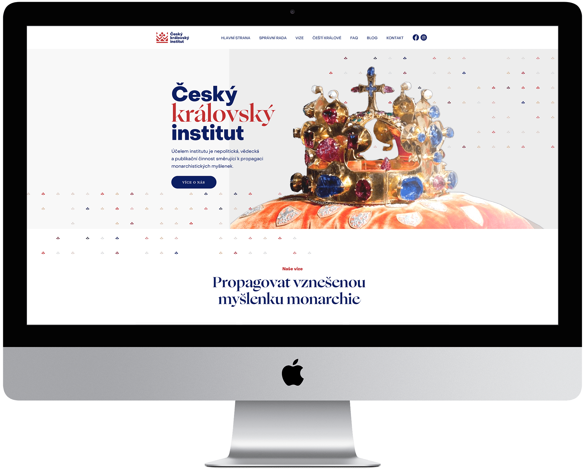
The goal was to unify and cover the brand's visual style, which will be consistent across platforms and resonate with the target group. This resulted in clear identification of the institute by the public.

1
Modern style with a touch of history and luxury
2
The logo symbol forms a square shape, with compact text on three lines
3
A visual element with variable use
4
Uniform visual identity
'Pen&Production created a new brand for us that accurately describes our institute and corresponds with our vision.'
JUDr. Zdeněk Prázdný, Český královský institut
